Visual Honesty with Eleonore Andersson

By Johanna Kamradt, 29 April 2026

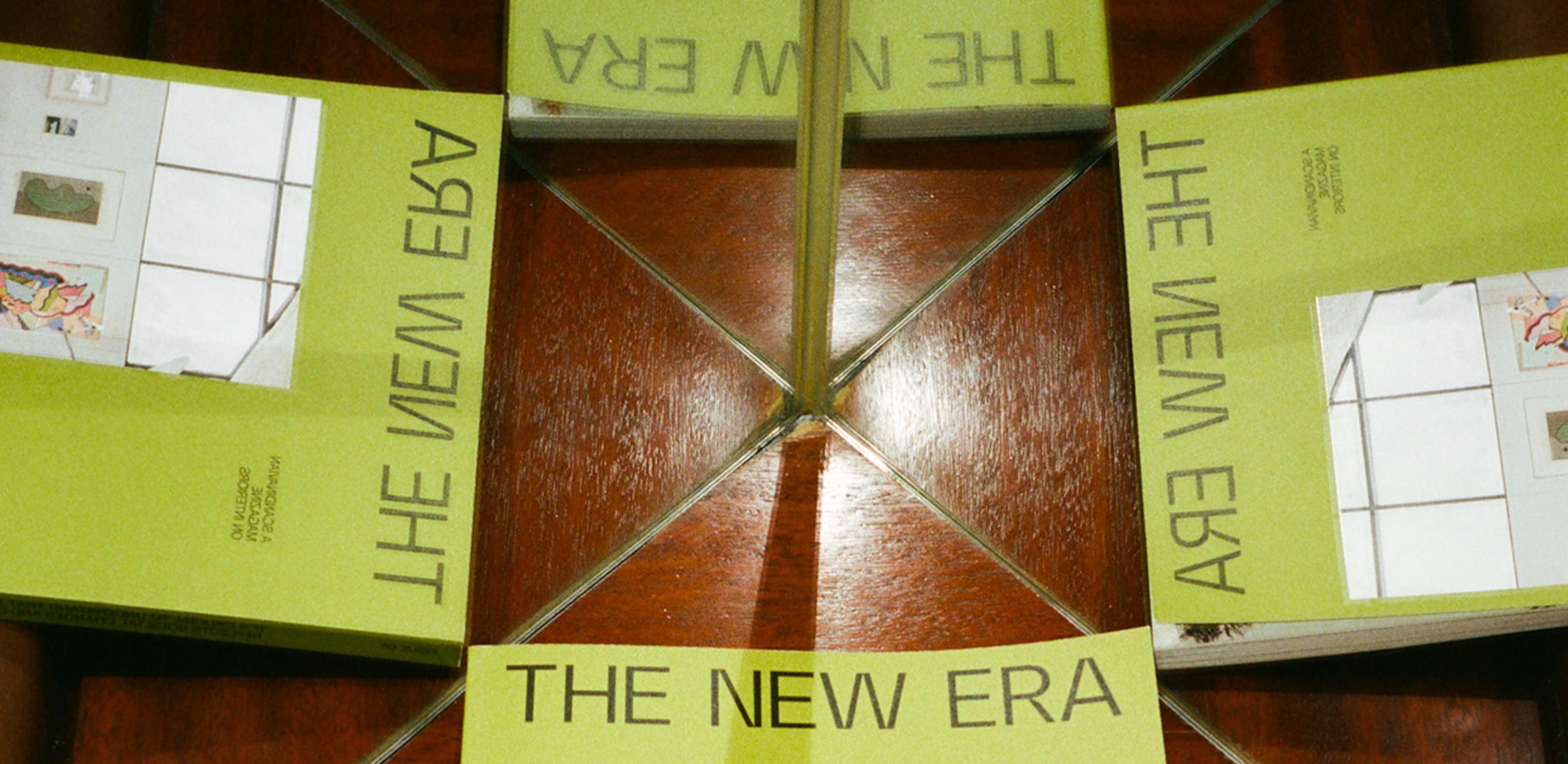
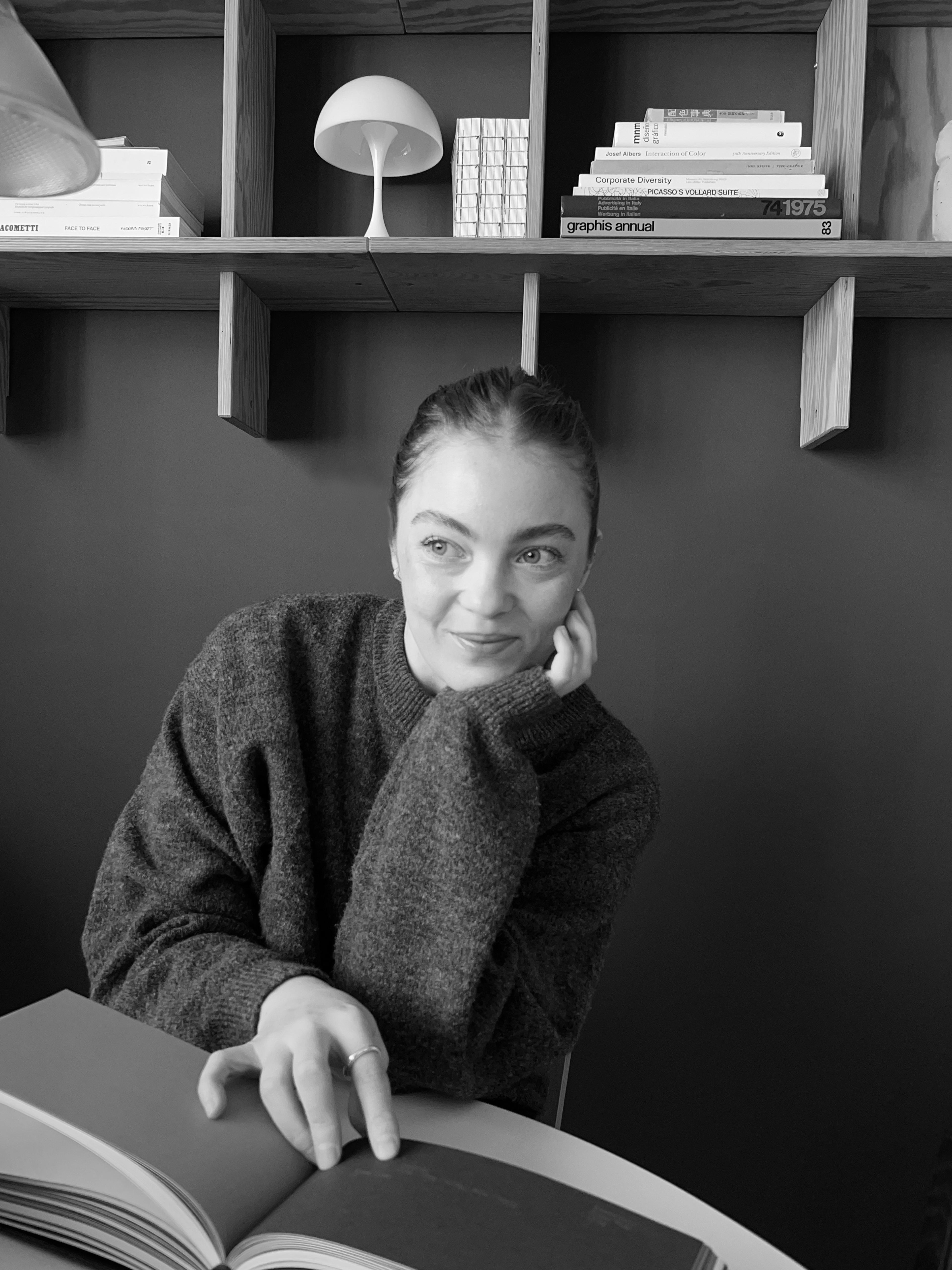
Eleonore Andersson designs with her hands first. Over the past eleven years, she's built a practice around visual identities that feel anchored rather than decorative, working with artists, studios, and brands who value conceptual clarity and the kind of design that ages well. Among her most significant projects is The New Era Magazine, an internationally distributed Nordic interiors publication she helped shape from initial concept through five issues and a pocket book, defining everything from its name and structure to its visual language and production.

In this conversation, Eleonore discusses why she designs around a hidden core idea, her shifting relationship with logos, and why she believes the next era of visual culture will be defined by one thing: evidence of the human hand.

You’ve been working as an art director and graphic designer for over a decade – how would you describe your design philosophy?

I approach design intuitively, led by ideas and emotion rather than fixed aesthetics. When working with physical space or print, tactility is essential for me; how something feels in your hand, for example – its texture, weight, and presence. No matter the scale of the project, I look for a clear conceptual core or idea; something the design can be anchored to and orbit around. I’m drawn to work that feels thoughtful rather than loud. A sensibility that mirrors my own way of observing and engaging with the world. In all my work, I try to design in a way that feels timeless but still very much rooted in the moment we’re living in.


Which steps do you take to approach creating a visual identity for a new client?

I always begin with research and by identifying a clear core to build the identity around. It doesn’t always necessarily need to be obvious on the surface, but it should quietly inform every decision and act as a guiding principle throughout the process. From there, I translate that idea into a visual system where each element supports the whole.


And how does this differ from how you approach defining a brand identity?

Defining a brand identity means stepping back. It’s less about form and more about intent, clarifying values, direction, and voice; the visual identity then grows out of that framework, as a way of giving those ideas a visual presence.

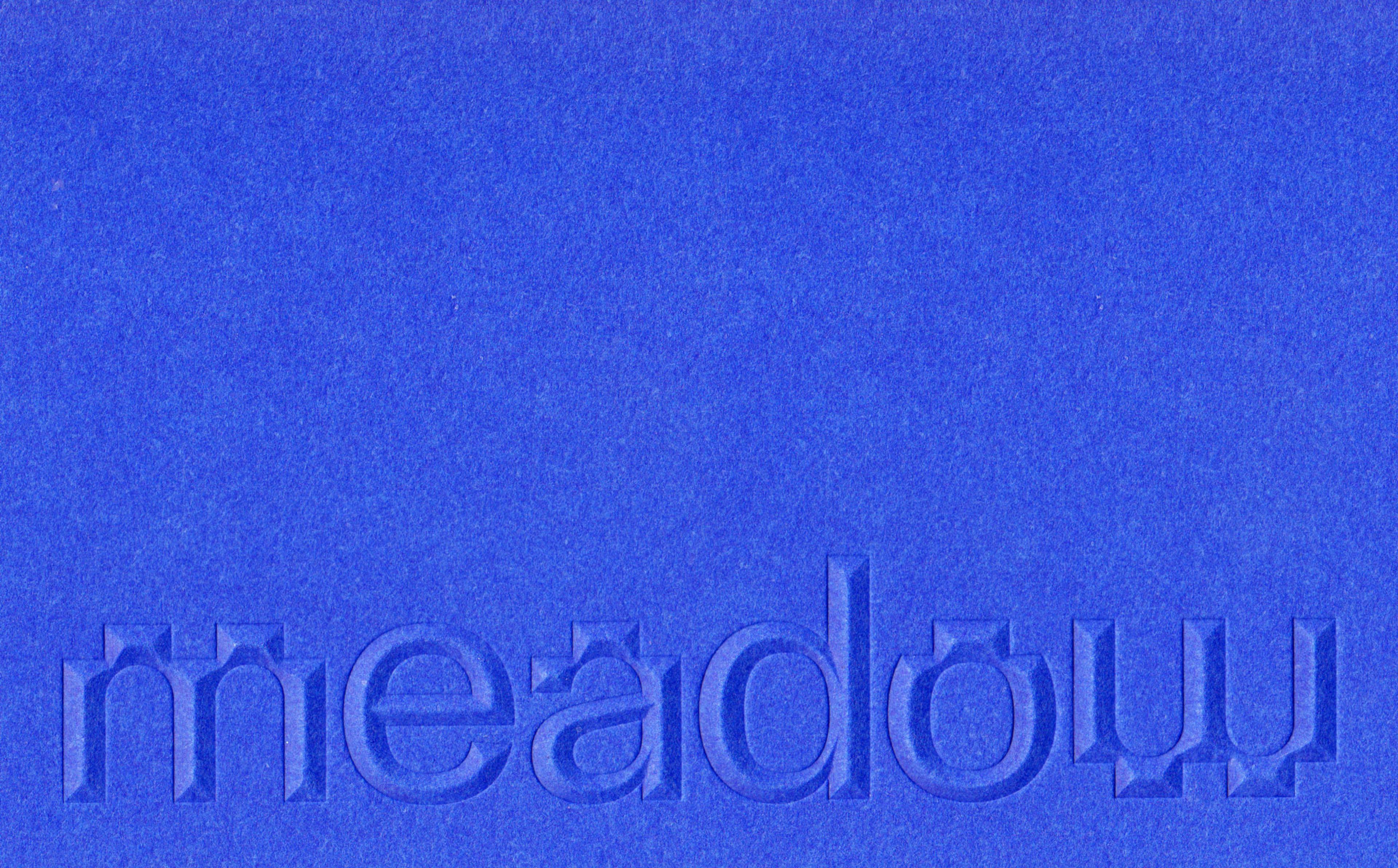
Visual identity for Meadow | Copyright © Eleonore Andersson

How do you approach choosing fonts for varying projects?

Typography is always closely tied to the idea behind the project. I choose based on the conceptual direction I’m working from, combined with the client’s needs and the practical requirements of use. I’m interested in how type can carry both emotion and function. It needs to support the idea, but also perform well in the context it will live in.


And how about developing logos?

Early in my career, logo design was the part of an identity I felt least connected to. I think that had a lot to do with the era, when minimalist wordmarks in humanist sans serifs were very present, and the logo was often expected to carry much of the identity and design system on its own. That way of working didn’t fully suit me as a designer. Today, I see logos differently, approaching them as one part of a larger ecosystem rather than the sole focal point, something that belongs to a whole and gains its strength from that context.


What’s in your essential design toolkit?

My essential toolkit always starts analog: a pencil and a sketchbook. That’s where ideas first take shape, whether through writing, thinking, or sketching, before moving to the screen. I value that direct brain-to-hand movement as an important part of my process. Digitally, I work across both a stationary computer and a laptop, and more recently an iPad, for illustration. In terms of software, I mainly use Illustrator, InDesign, Photoshop, and Figma.


Can you walk me through a recent project that felt particularly meaningful to you?

I just completed a visual identity for a Swedish premium footwear brand. What made the project particularly enjoyable was the close and thoughtful collaboration with the people behind it, who had a very personal connection to the brand. That shared level of care and trust created a strong foundation for the process, and meant that the ideas and decisions felt well aligned. It allowed the identity to take shape in a way that felt considered, honest, and true to the brand.

Working editorially sharpened my intuition around image selection, pacing, and storytelling.

What prompted you to help develop The New Era Magazine in 2020?

I was asked to develop the visual identity and graphic design for it in 2020, at a stage when it was little more than an initial idea – a publication of some kind, related to interior design and architecture. Together with the editor-in-chief, I helped develop the entire format and content from the ground up, shaping everything from name, structure, and editorial framework, to how the magazine would look, feel, and function. I was responsible for the complete design and layout of the magazine, as well as overseeing print production.

Over the years, I art directed and designed five issues as well as a side publication pocket book, and while I’ve since stepped away from the project, it remains a significant part of my portfolio. Working editorially sharpened my intuition around image selection, pacing, and storytelling. It also strengthened my sensitivity to zeitgeist – understanding what feels relevant to highlight in a given moment, both culturally and visually, which has deeply influenced how I approach client work.

How does being based in Stockholm influence the work you create?

I’m influenced by my surroundings and often need to look outward when starting a project: architecture, streets, materials. Movement and thinking while walking are also essential parts of my creative process. The city becomes a quiet but constant reference point.

What shift in visual culture do you think will define the next few years?

A growing desire for the presence of the human hand – imperfections, tactility, and visible traces of the process. A kind of visual honesty that signals care and intention, and quietly shows that something has been made by a person rather than being generated. I think this sensitivity will become increasingly widespread.


What aspect of design culture from earlier in your career do you wish was still prioritised today?

A more collaborative way of working. I miss processes where creatives worked more closely together rather than in silos for the sake of efficiency. Those shared conversations often lead to stronger ideas.


Which creative practices outside your own inform your work?


People who work across disciplines – designers who write, artists who think conceptually, and creatives who are deeply curious rather than style-driven.


Is there a specific medium that you regularly return to for professional inspiration?

Two books: “Design As Art” by Bruno Munari and “Caps Lock: How Capitalism Took Hold of Graphic Design, and How to Escape from It” by Ruben Pater.

If you could master one skill outside design, what would it be?

Writing. The ability to articulate thoughts with precision is something I deeply admire.


If you could go back and give yourself one piece of advice at the start of your career, what would it be?

Trust your intuition.


Looking ahead, what excites you most about the next chapter of your work?

I’m excited about taking on larger projects, deeper collaborations, and continuing to challenge myself creatively.

It’s more about intent, clarifying values, direction, and voice; the visual identity then grows of that framework.

Quickfire questions

What is your most treasured possession?

My dog, Benny

Which TV show or movie could you endlessly rewatch?

Lost in Translation

What is your most-used (non-default) app on your phone?

Instagram :(

Which book do you recommend most often?

A Room of One’s Own, Virginia Woolf

What sound do you love?

The muffled sound in the city when it’s covered in snow.

Which piece of art most recently stuck with you?

The Picasso exhibition at
Moderna Museet in Stockholm

What is your greatest extravagance?

Food, vintage clothes, and books.

What is your favourite word?

Drömmigt (“dreamy”).

What’s the last great concert you went to?

Dina Ögon