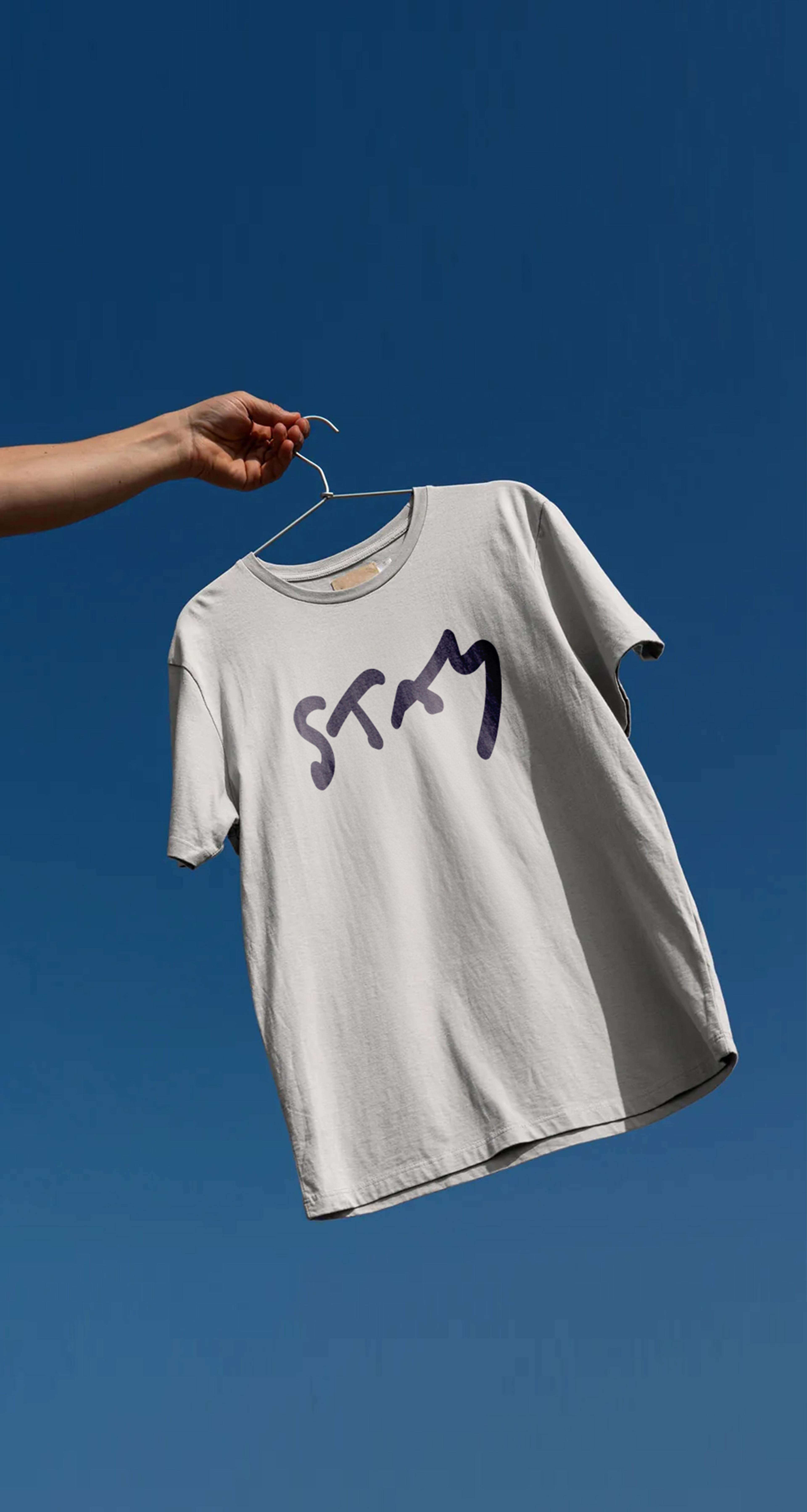
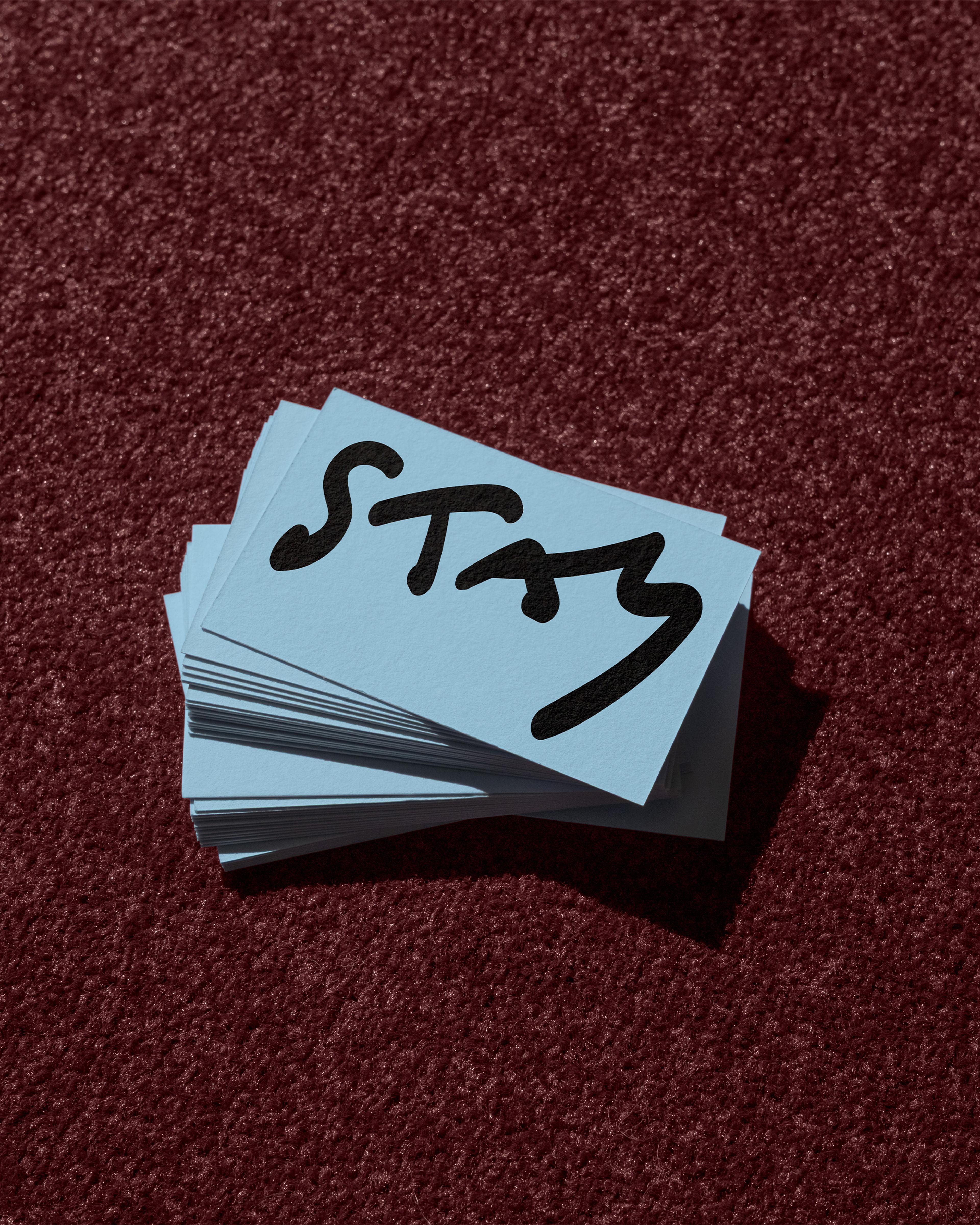
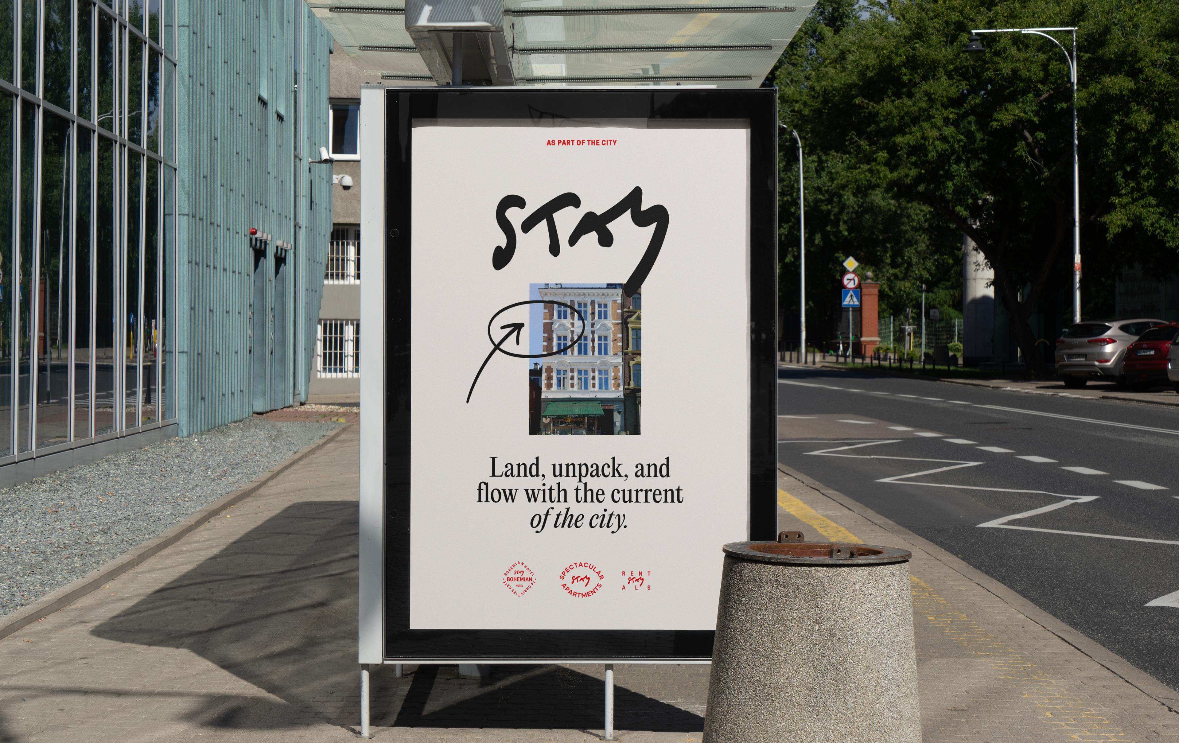
Stay - as part of the city
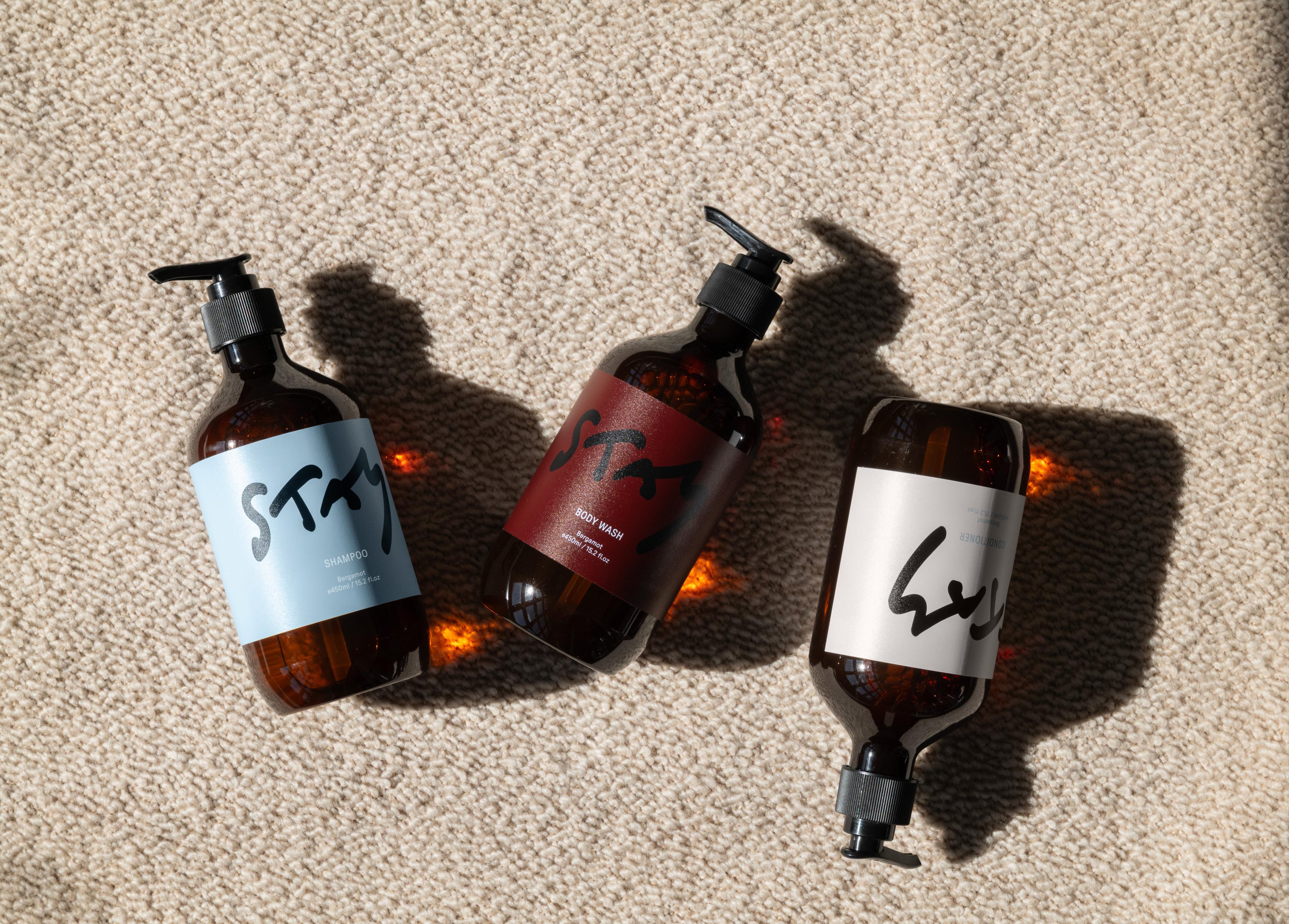
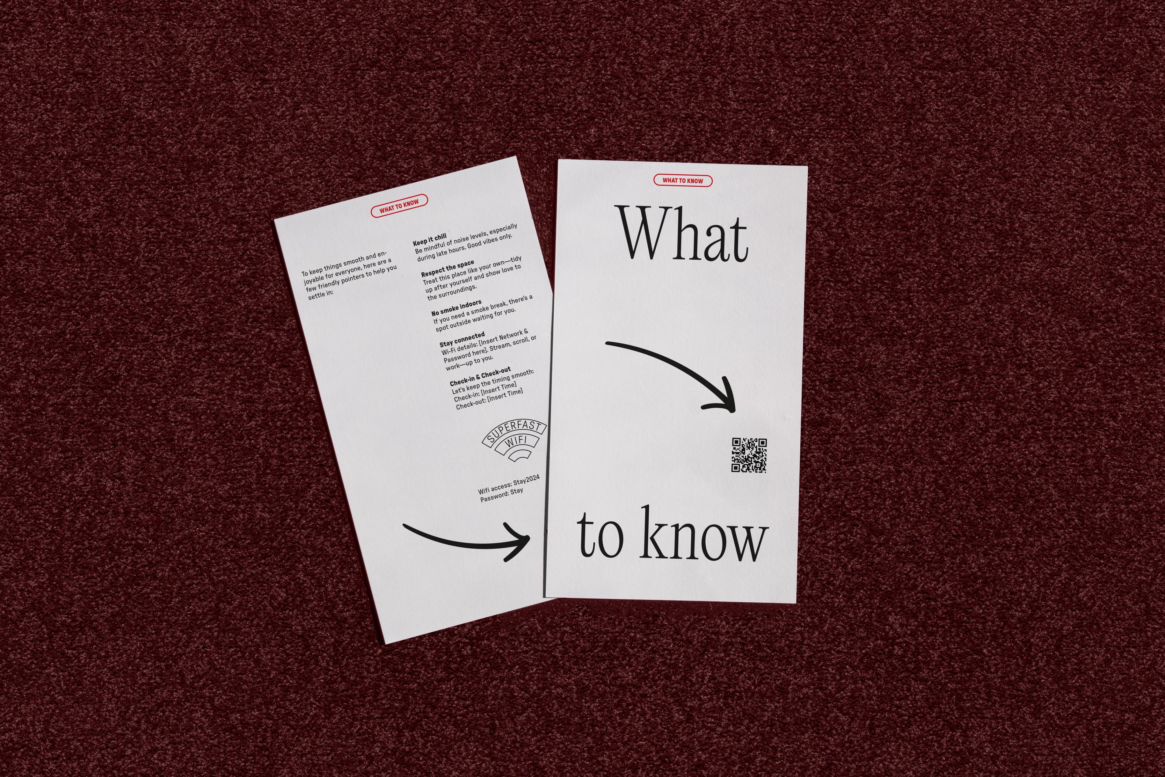
- Brand Identity
- Tonality

Stay offers a simple, modern way to travel - combining the comfort of a hotel with the freedom of self-catering. Guests can choose from a range of stays, from central hotels to high-end apartments, all with keyless check-in, 24/7 online support, and an easy booking experience. Always in prime locations, Stay connects you to the best the city has to offer. Based in Bergen, Norway, it’s built to scale - ready to bring its approach to more cities.
“It feels like us — and honestly, we love how it looks. The work Noerd did with our branding gave Stay a competitive edge and a scalable identity.”
Team:
Design Director: Dan Bunnskog
Copywriter: Denisse Ariana Pérez
Web Designer: Lilit Asiryan
Site Developer: Micke Ring
Motion Designer: Studio Reje
Project Management: Noerd
Client:
Stay